
AlRayan
Bank
Case Study & Signage Inspiration

The Brief.
About the client.
Following a major rebrand, Al Rayan Bank turned to Signs Base to deliver a complete signage transformation across its Birmingham headquarters and London branch. With a bold new logo and updated font set in two distinctive shades of blue, the refreshed identity called for signage that was not only visually striking, but also precisely coordinated with the official brand relaunch set for a Monday morning.
-
![]()
10mm Acrylic 3D Logo on Slatted Wall
-
![]()
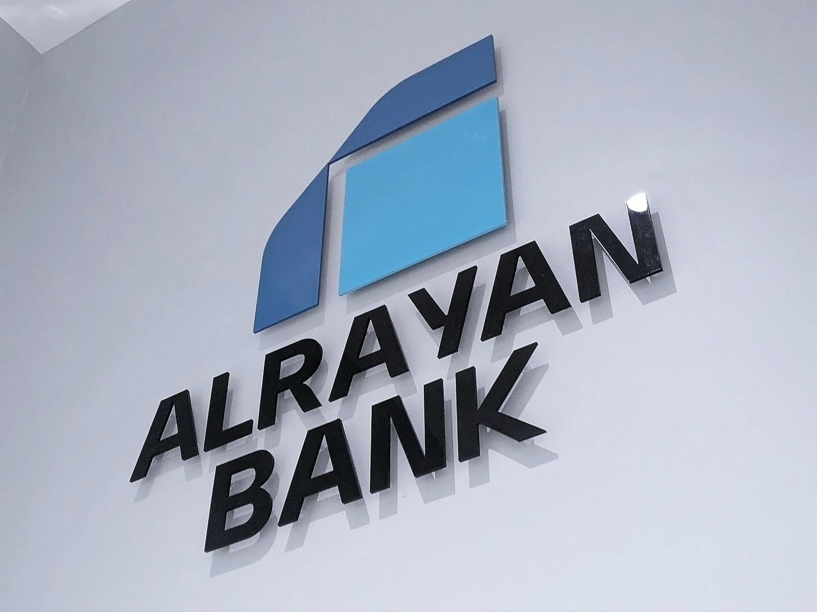
5mm Flat Cut Acrylic Wall Logo
-
![]()
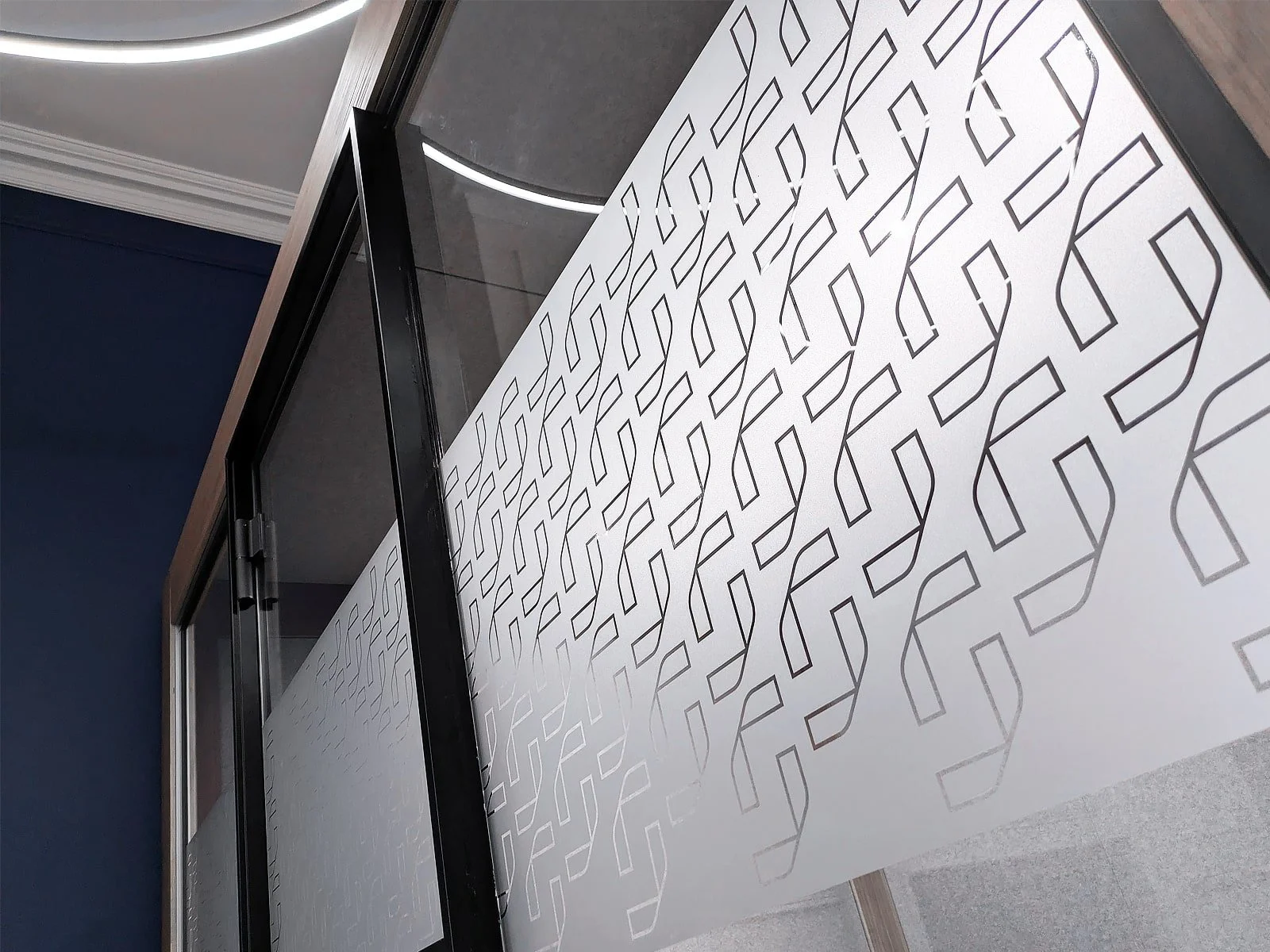
Frosted Glass Manifestations with Cut Out Logo
-
![]()
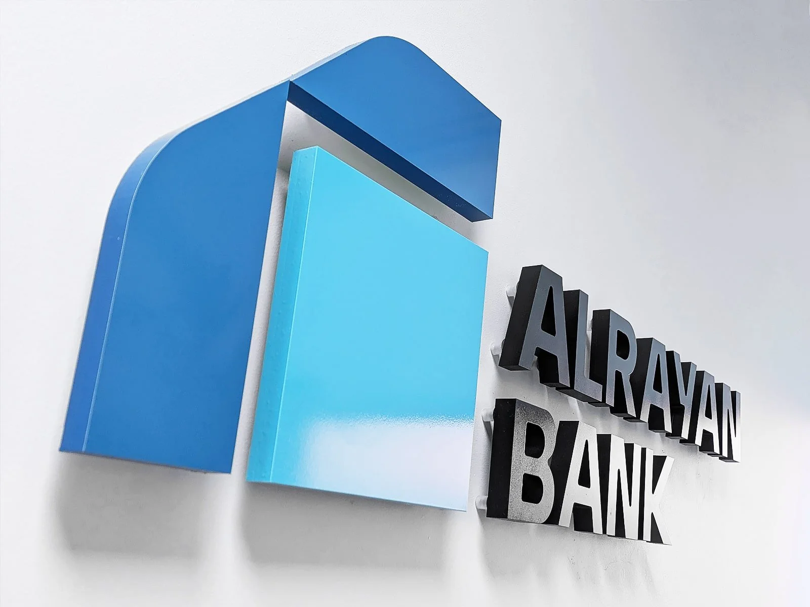
Aluminium Sign Tray with 3D Acrylic Logo
-
![]()
External Brass Plaque with Engraved Logo
-
![]()
Outdoor Printed Flag with Company Logo
-
![]()
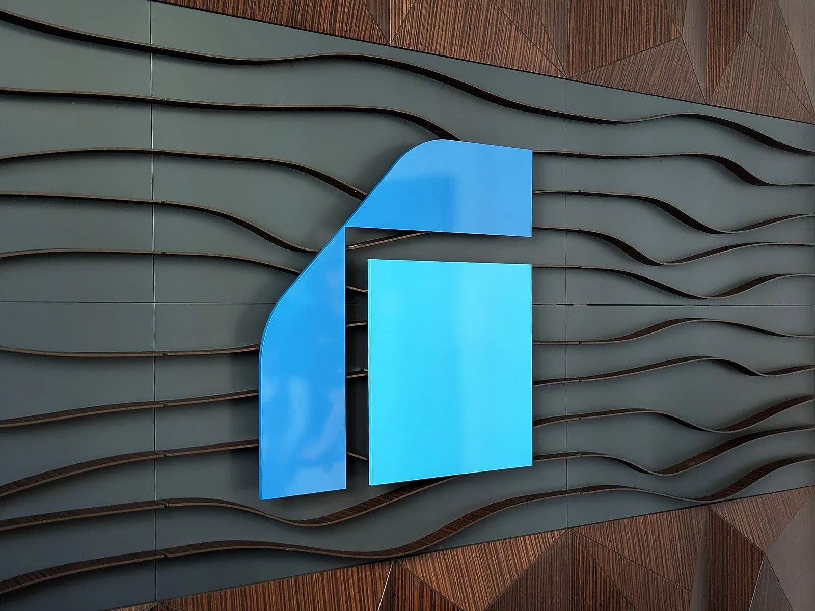
20mm 3D Acrylic Wall Logo
-
![]()
Custom Meeting Room Signage

The Project
Both branches needed to be updated simultaneously over a single weekend, ensuring that when doors opened on Monday, every interior and exterior detail aligned with the bank’s new visual direction. Signs Base worked closely with the rebrand team to manage design, production, logistics and fitting without disrupting banking operations or client access.
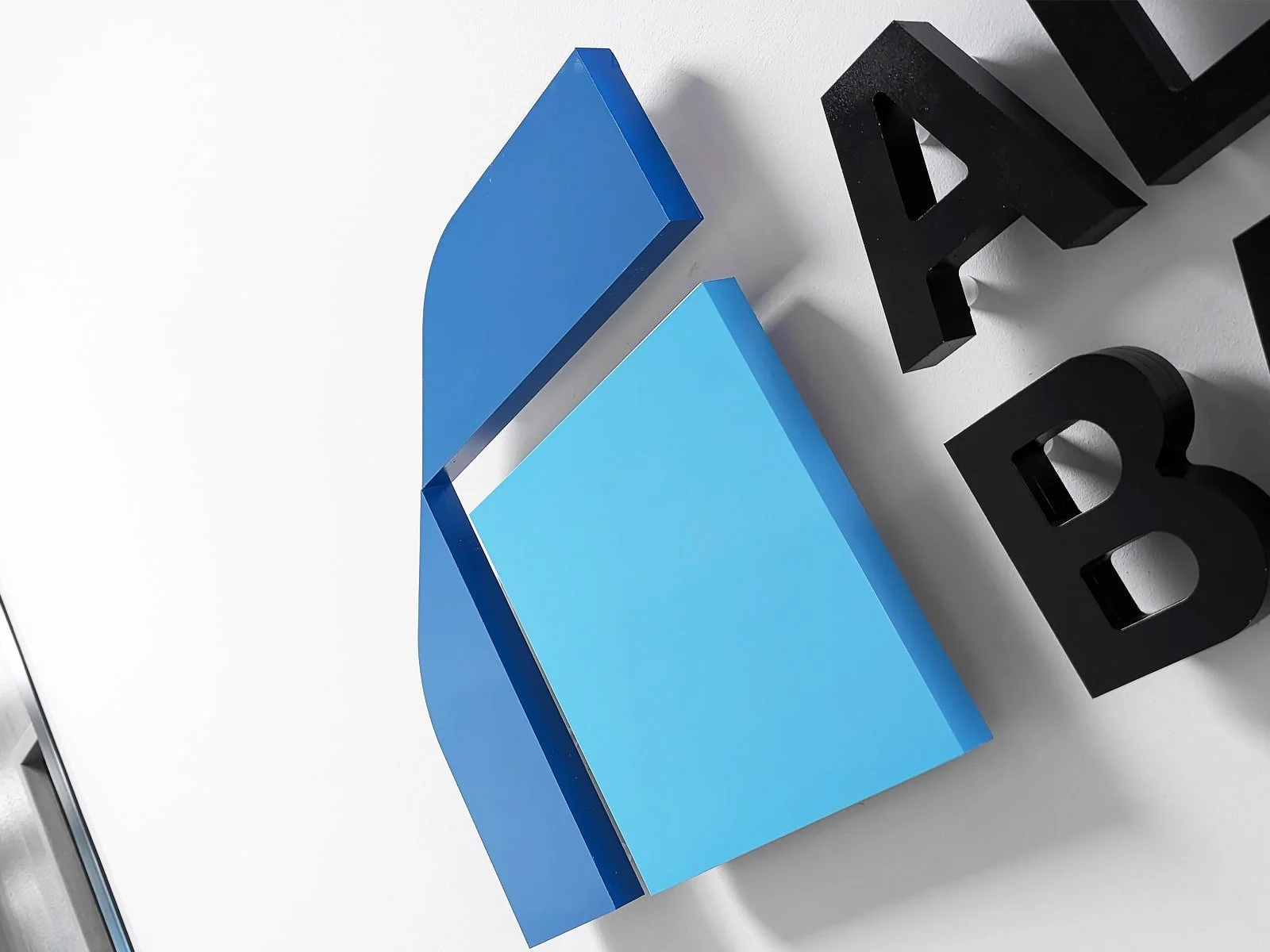
In both branches, 20mm-thick 3D acrylic logos were installed internally, creating a premium finish that offered depth and visibility while keeping in line with the minimalist, modern tone of the rebrand. These raised logos were manufactured to colour-match Al Rayan Bank’s updated blue palette.
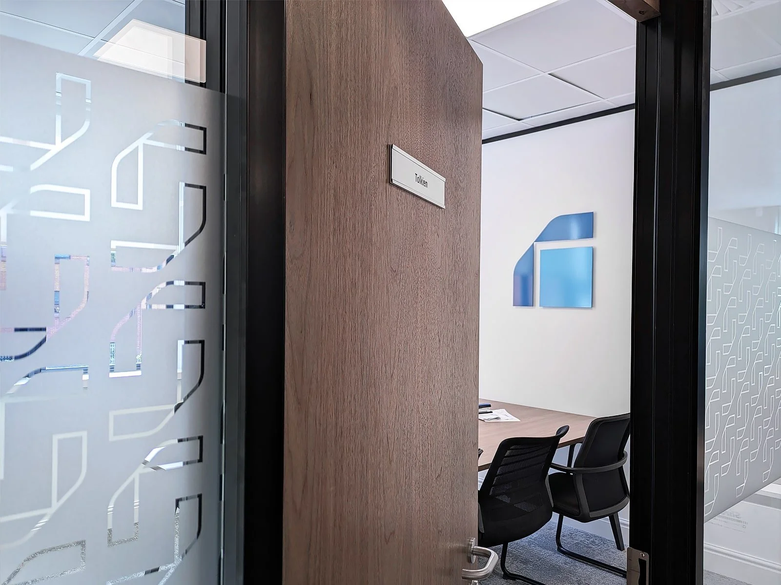
Glass partitions and entryways were dressed in custom frosted vinyl manifestations—a subtle yet effective feature incorporating the bank’s logo through carefully cut-out patterns. These not only enhanced privacy and compliance but also extended the brand identity across customer-facing and internal areas.
For poster displays, Signs Base produced new inserts for existing acrylic sandwich-style frames, ensuring all marketing messages reflected the updated fonts and colours. These were delivered pre-cut and pre-aligned for quick replacement over the weekend in both London and Birmingham.
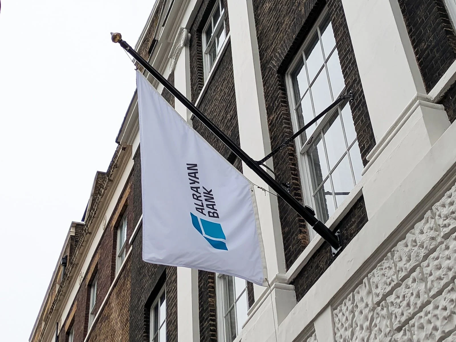
In London, a new flag was also installed to reflect the updated brand colours serving as a clear, street-level marker of the bank’s new visual presence.
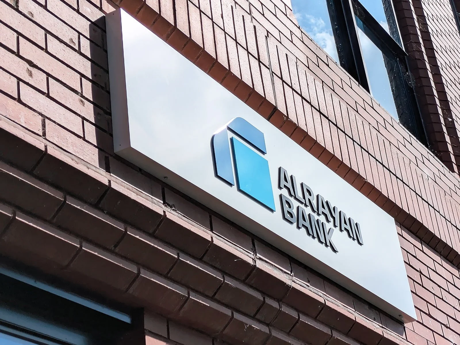
The most significant transformation was seen on the external façades. In Birmingham, the team installed powder-coated aluminium sign trays featuring 5mm 3D acrylic logos for a more contemporary finish.
Inside the Birmingham office, additional 5mm acrylic logos were installed in boardrooms and meeting spaces, ensuring the updated identity carried through to every internal touchpoint - from reception to client consultation zones.
Two dedicated fitting crews worked in tandem across both sites over the weekend, coordinating in real time to ensure consistency and completion before the rebrand went live on Monday morning.
The result was a seamless transition that brought Al Rayan Bank’s new identity to life across both major locations - without a minute of downtime.
By focusing on accuracy, brand consistency and precise timing, Signs Base ensured that every element of signage supported the refreshed image of a trusted, modern and forward-looking financial institution.
Like what
you see?